Lynda.com Login Help
Lynda.com videos are free to Virginia Tech students with your VT.EDU login. Start at the VT.EDU login page to access these resources.
One of my favorite ways to talk about strong document design is the CRAP method. CRAP stands for Contrast, Repetition, Alignment, and Proximity. Using all four of these elements helps give your work a polished appearance and catches readers’ attention.
Today’s #Infographic (from Paper Leaf Designs) gives you a quick overview of all four elements. It is worth saving for future use, and try applying it to your professional bio assignment before you turn it in on Monday.
For a more detailed explanation of the CRAP elements, watch the Lynda.com video, Understanding the PARC system (Lynda.com was apparently afraid to say CRAP, so they spell it backwards).
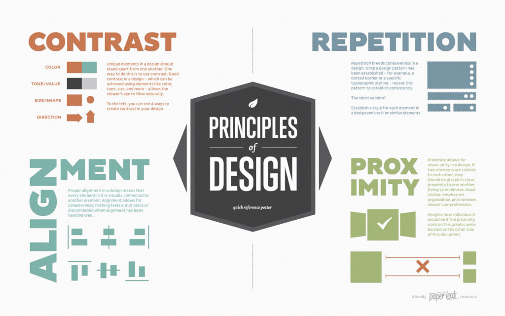
Note: This infographic has a text-based transcript.
7 Comments
I have always found the design aspect of writings very interesting. particularly the fact that you can get a readers attention without them even knowing what they are going to be reading about, or on the other hand the fact that a reader can know what they are reading before they even see a word just by the layout of the page.
Although I’ve never heard of the CRAP method before, I feel like I’ve been using a version of this method in my writing. I like my writing to be visually appealing to a reader. With that being said, I like everything to be aligned with the use of bullet points and with the same formatting.
In high school I took a sculpture class and it used this method to help create visual appeal within our pieces. It wasn’t called the CRAP method, but looking back at the projects we did each of these words were used in one way or another. It’s very interesting to see that in whether it be writing or mixed media that visual appeal spans multiple mediums.
Whenever I had to do reports in high school, the part I struggled with most was setting up my presentations in an attractive way and making it look not cluttered. I always tried to follow the 6×6 rule for PowerPoint slides, but there was never a rule taught to us about setting up our papers. I think the most attractive part of graphics is the alignment, as it can make it look very crisp and clean, not messy and disorganized. Repetition also looks very good to me, especially when its a repetition of colors.
When I have to do power point presentations the aspect I use the most in CRAP is repetition in the form of Patterns. People subconsciously love to follow patterns because it makes information easier to take into the brain. This is especially useful when you have to explain really complicated stuff that you discovered during a research project. keeping a simple pattern inside the information not only helps keep relevant information in nice little chunks, but also ques the brain to be more receptive. I sometimes put too much stuff on one slide though, so there is a balance to everything.
Hi Paul,
This is the first time I have heard of the CRAP method, but the Pattern section reminds me of how typefaces are designed to be easily readable. Good typefaces make reading very easy because their characters follow simple patterns. Serif fonts, for example, like Times New Roman have feet on the top and bottom of lowercase letters that act like grooves that guide the eye along the line of text. Pattern recognition, even down to the typeface, is a powerful tool for writers.
This is my first time I heard about the CRAP method but I usually prefer to my presentations or writing to be simple and organized because having too much stuff will distract the audiences. I enjoy watching the video where it explain each element very well.