Infographic Transcript
Transcript by Thomas Conroy
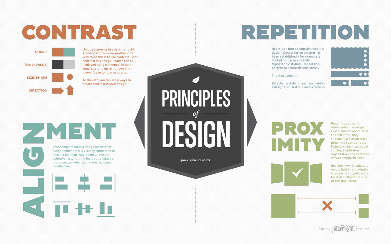
CONTRAST
Unique elements in a design should stand apart from one another. One way to do this is to use contrast. Good contrast in a design—which can be achieved using elements like color, tone, size, and more—allows the viewer’s eye to flow naturally.
The image shows 4 ways to create contrast in your design:
- Color
- Tone / Value
- Size / Shape
- Direction
REPETITION
Repetition breeds cohesiveness in a design. Once a design pattern has been established – for example, a dotted border or a specific typographic styling – repeat this pattern to establish consistency.
The short version? Establish a style for each element in a design and use it on similar elements.
ALIGNMENT
Proper alignment in a design means that every element in it is visually connected to another element. Alignment allows for cohesiveness; nothing feels out of place or disconnected when alignment has been handled well.
PROXIMITY
Proximity allows for visual unity in a design. If two elements are related to each other, they should be placed in close proximity to one another. Doing so minimizes visual clutter, emphasizes organization, and increases viewer comprehension.
The image states, “Imagine how ridiculous it would be if the proximity icons on this graphic were located at the topic of this document,” and shows related icons on separate sides of a column of text (so they no longer use proximity for visual unity).
Infographic source: a handy paper leaf resource