Lynda.com Login Help
Lynda.com videos are free to Virginia Tech students with your VT.EDU login. Start at the VT.EDU login page to access these resources.
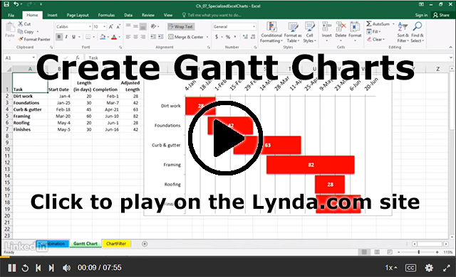
As you probably know, Gantt charts are one of the ways that you can organize the schedule for your project to make the details clear and easy to follow.
Today’s #Watch is a Lynda.com video that explains, step-by-step, how to use Excel 2016 to Create Gantt charts (7m55s). Videos are also available for these versions of Excel:
After watching the video, check out the contents for Excel 2016: Charts in Depth, the course that the Gantt Charts video is part of. It includes details on several other kinds of charts and more advanced information on using Excel to create charts.
If you are curious about Gantt charts, you can also watch the Lynda.com video Learning Gantt Charts (1h17m).
Note: This video has closed captioning, so it does not need a transcript.
2 Comments
I think that this method of Gantt chart creation is better for long term projects that span multiple months. With the one I have, I made a simple table with column headers for the date, as well as row headers for the tasks. I filled in blocks that corresponded to the right dates and tasks. While I like my current design, I think I will try using Excel and see how the two are different.
I agree. I used Gantt charts for two of my project. they are extremely helpful for projects that span the whole semester, and have multiple sub-teams working on them. For my genre analysis report I used a simple table because I am the only one working on it, and there is no clear critical path, at least for mine.
Gantt charts are very helpful and everyone should use them or at least learn how to use one!