Lynda.com Login Help
Lynda.com videos are free to Virginia Tech students with your VT.EDU login. Start at the VT.EDU login page to access these resources.
Document design matters in every project you will compose in the workplace. If you think back to the CRAP infographic, you know that your choices can influence a reader to examine your document fully or to skip it altogether. Bad document design often leads folks to declare, “tl;dr” (or “too long; didn’t read”).
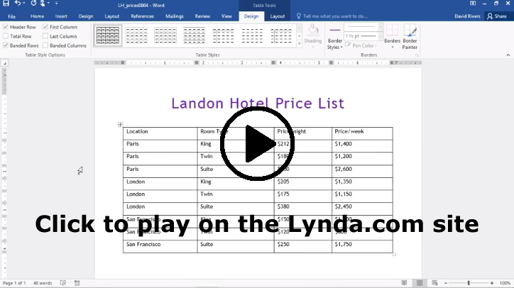
You can improve your Analysis project by paying attention to the layout and formatting for your table. For this #Tutorial, I’m sharing some Lynda.com videos that demonstrate basic options for Formatting Table Appearance for Word 2016 and Word 365. If you have another version of Word, you should notice similar options in your version.
To learn even more about how to design your table, watch the entire chapter on Tables for either version or skip around and choose the sections you need:
- Chapter 8: Working with Columns and Tables in Word 2016
- Chapter 8: Working with Columns and Tables in Word 365
Note: These video have transcripts, so they do not need transcripts.
4 Comments
Tables can be very boring sometimes, and I think that adding pops of color and formatting styles (font, placement, etc.) are imperative when it comes to drawing in the reader’s attention and keeping him or her interested. I think some people may struggle with picking the right colors and will choose shades that are not easily readable (for example, a yellow background with white or lime green font). My goal for the Analysis of Writing project is to make an attractive table, and I will definitely use this information during my design process.
Word has so many useful tools that I had no idea existed until now. Whenever I needed a table I would always use an excel spreadsheet and mess around with the cells until the table looked right. I wish I saw these videos earlier when I started my work log. Currently I am using excel for it but the reflection column is awkward to read and difficult to edit. I plan on using a word’s table tool for my next work log.
Not only should the information be accurate in the table, but also the table itself should be visually appealing to the audience. I like to bold the headings and center them in the first row. I don’t usually use a colored background, but I might try it out for this assignment.
From what I understand, Excel and Word, since they are both Microsoft products, play nice together when working with tables. It seems, however, Word has some nice features that I did not know about when dealing with tables, and I will be using that software. The preset table designs make creating appealing-looking tables nearly pain-free.