You can often show trends and comparisons better with graphical elements than with text descriptions. Consider the difference between describing the performance of a stock or a portfolio during the last year and showing that performance with a line chart. Here’s an example from the Student-managed Endowment for Educational Development (SEED) 2016 Annual Report. Which seems easier to read and process to you?
Text Description
The portfolio performed relatively in line or slightly below the respective benchmark until the final quarter, as shown in Exhibit 1. We included the Consumer Price Index as a preservation of spending power benchmark to monitor changes in our real returns. From mid-November to year-end, the portfolio significantly outperformed and finished 2016 with an active return of 5.13%. In order to calculate our risk-adjusted return, we incorporated our portfolio’s beta of 1.2 and historical average for yields on the 1-Year Treasury note (1.84%) in order to compute a CAPM-based implied alpha. This calculation resulted in an implied 2016 alpha of 3.11%.
Line Chart
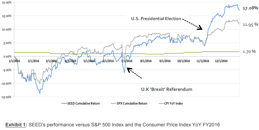
For my money (yes, a pun), the line chart is much easier to understand quickly. In many circumstances, you will include both a text description and a graphical representation. The point of today’s post is that the graphical version is not just an illustration. It is critical to showing the reader information about the topic.
For your #Write, think about how you can add graphical representation of information in your progress report. The infographic below shows a collection of graphics you can use to communicate information. Visit the post How to Think Visually Using Visual Analogies from Anna Vital for a larger version of the image and short details on the various kinds of charts and graphs.
Once you explore the options, add a comment, if you want, that discusses a graphical representation that you might use in your Progress Report. Talk about what you have chosen, how you will use it, and why it will be effective in communicating with me about your progress.
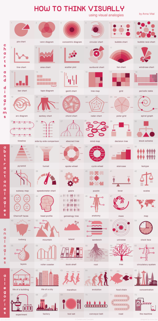
Source: How to Think Visually Using Visual Analogies from Anna Vital
Note: This infographic (How to Think Visually Using Visual Analogies) needs a text-based transcript. See the Optional Accessibility Transcript Activity for more details.
4 Comments
I think a Gantt chart, which was introduced last week, is the best way to visually display a schedule and the progress that is made. Gantt charts were designed for this purpose. I’m not certain I will use it in the progress report, however, because the tasks had such short time periods, I don’t think it would be that useful, but it’s the best option in my opinion.
I have always preferred visuals and graphics when I am trying to learn or understand something. I think since people’s dialogue varies so much, there is a lot of room for misinterpretation in writing, but visuals can be universal. However, I prefer the traditional graphics like pie charts or line graphs. In my opinion, some of the more detailed visuals like bubble and chord charts are a little over-complicated. Unless someone has seen them before, they can just make things harder to understand.
I agree with Tom about his Gantt chart observation. If the Genre Analysis covered at least two weeks or more, reporting progress with the Gantt chart would have made more sense, as there would still be time left in between the beginning of the project and the progress report. Regardless, I did modify the one I had made for the Short Proposal to reflect any alterations I made to my schedule, and while there were very little tasks to complete, it got the job done.
Although I did not use any visual aids in my progress report, the one I think is most beneficial would be the the “Chord chart” presented in the “How to Think Visually” infographic. One thing I tried to do in my genre report is to link together many of my interest into the report. Doing this would give it some extra utility when I plan on submitting a scientific article to a publisher in the future. Chord charts are great at presenting the information and tethering ideas and forming connections. Using a chord chart could visually show how I organized my thoughts.