 Today’s #Tutorial focuses on the alignment of the text in your document. Remember the #Fact that explained the F-shaped reading pattern? That idea comes into play with this tip to avoid centered text alignment in your documents.
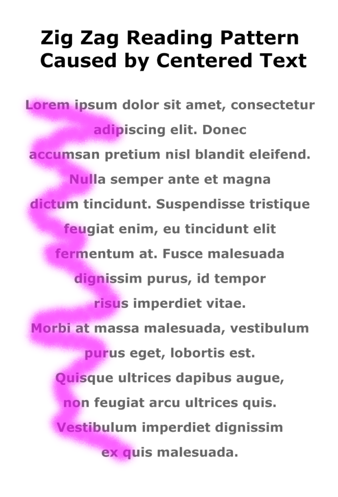
When you center text, the left margin zig zags back and forth down the page, which makes it hard to read in the F-shaped pattern that people prefer.
Instead of skimming down the left margin to look for the highlights and headings, the eye has to search back and forth for the information on the page, as shown in the image on the right.
Learn More
Watch the following Lynda.com tutorial video, Favor flush-left, ragged-right body text (4m14s), for additional explanations and tips on this important guideline for the way that text is aligned on a page. Remember that Lynda.com videos are free to Virginia Tech students with your VT.EDU login. Start at the VT.EDU login page to access these resources.

Note: This video has closed captioning, so it does not need a transcript.
6 Comments
Tying this back to the #Infographic for today and the importance of understanding the differences in cultures, we can see how our writing style is also affected by this. When written, some languages are read from right to left as opposed to left to right and require that the right edge of the text be flush to make the writing easy to read. It is also important to consider the style of writing you are using when determining how to align your text. If you are using a column format, it might be more beneficial to avoid justifying the alignment to avoid “rivers” in your paper. On the other hand, having lines that span the entirety of the page might benefit more from this style of writing as it makes it easier for the reader and does not have the side effect of creating “rivers”.
Flush left is the best choice for body text alignment when reading from left to right. It eliminates rivers and it’ll make your document look more modern. Flush right would be good choice for languages that are read from right to left like Arabic and Hebrew.
I have never seen rivers in justified text until now. I always saw gaps, but not patterns of gaps that travel from line to line. Now I will never be able to un-see them in newspapers and wherever else justified text is used. I suppose that is a reason why I never saw justified text as a problem until after watching the video.
On a side note, I wonder if languages that are read right-to-left have an inverse “F-shaped” reading pattern.
Hey,
I speak Arabic and we write from right to left. Yes, we have an inverse F-shaped reading pattern.
I never took the time to understand how flush left and justified were different. The fact that these little rivers appear in justified writings is now much more obvious, and I can definitely understand how they can be distracting. I used to always center the information in my writings, but after seeing how flush left makes the paper look cleaner, I will definitely be more aware to use flush left from now on.
I think it’s interesting that the way writing is aligned defines the purpose of the writing. You would almost never use centered text for writing a traditional paragraph,but its almost required when writing a title. Personally I don’t like justified text alignment because the rivers become prominent in my writing. The only time I would ever use justified is if it removes widowed or orphaned words from the bottom of my text.